Visualizing models & uncertainty
Design Principles for Visual Analytics in Operations Contexts
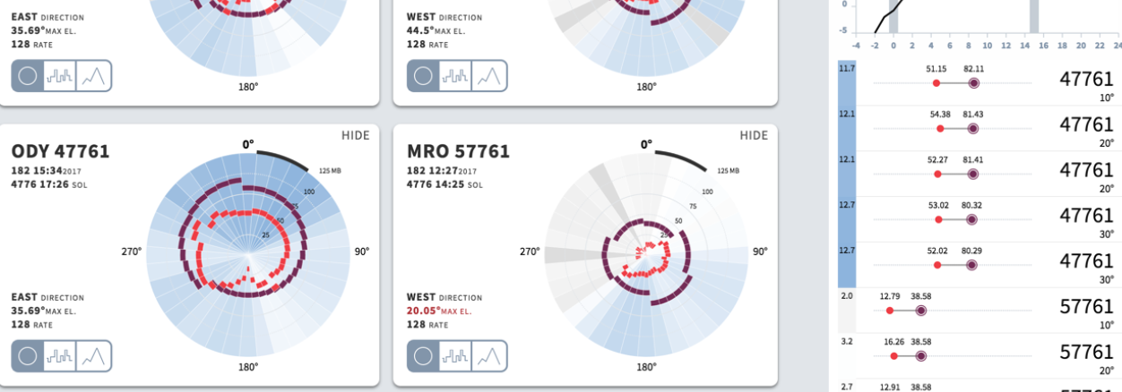
Operations engineering teams interact with complex data systems to make technical decisions that ensure the operational efficacy of their missions. To support these decision-making tasks, which may require elastic prioritization of goals dependent on changing conditions, custom analytics tools are often developed. We were asked to develop such a tool by a team at the NASA Jet Propulsion Laboratory, where rover telecom operators make decisions based on models predicting how much data rovers can transfer from the surface of Mars.
Through research, design, implementation, and informal evaluation of our new tool, we developed principles to inform the design of visual analytics systems in operations contexts. We offer these principles as a step towards understanding the complex task of designing these systems. The principles we present are applicable to designers and developers tasked with building analytics systems in domains that face complex operations challenges such as scheduling, routing, and logistics.

Visualizing Elections Forecasts
The needle analyzes incomplete results to show who is on track to win an election. The core issue is that election results early in the evening are usually not representative of the final vote. Sometimes, only one kind of vote — like mail-in ballots or Election Day votes — has been counted. Other times, reported results are from only one part of a state. You would need to be a bit of an expert to figure out whether a 20-point Republican lead in the early Virginia results is a) to be expected; b) a sign of a Republican landslide; c) actually a sign of an unexpectedly large Democrat win.


The Beginner’s Guide to Dimensionality Reduction
Dimensionality reduction is a powerful technique used by data scientists to look for hidden structure in data. The method is useful in a number of domains, for example document categorization, protein disorder prediction, and machine learning model debugging. The results of a dimensionality reduction algorithm can be visualized to reveal patterns and clusters of similar or dissimilar data. Even though the data is displayed in only two or three dimensions, structures present in higher dimensions are maintained, at least roughly. This guide will teach you how to think about these embeddings, and provide a comparison of some of the most popular dimensionality reduction algorithms used today.

